Making a graph on Microsoft Excel is easy once you know how. You can create a line graph, or a bar graph or pie chart. But the easiest way to create a graph in Microsoft Excel is with the built in tools.
In the context of Microsoft Excel, workbooks or spreadsheets contain a lot of data. If your workbook mainly consists of only text, the data can become confusing and hard to interpret. Thus, having a graph or chart on a spreadsheet is strongly encouraged because it allows you to communicate the details visually and relay the core message.

Graphs are useful for showing and explaining multiple details, such as the meaning behind the numerical values. They also ease your statistical analysis, especially when making comparisons or examining trends.
In this walkthrough, you will learn the basics of making a graph using Excel, from adding one to editing it.
Add A Graph in Microsoft Excel
Start the Excel app
1). You may open Excel in two ways: by clicking Start (Windows logo) or typing "excel" without the double quotation marks on the Search box on your Taskbar.
![]()
If you already have an existing Excel workbook with data input, skip Steps 2 and 3, navigate to that file's folder location, and open it instead.
2). Click on Blank Workbook once Excel shows up.
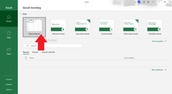
The Blank workbook option is accessible on the app's Home page or the New tab on the left panel.
A new spreadsheet will open afterward.
3). Type in your data before you proceed to add a graph.
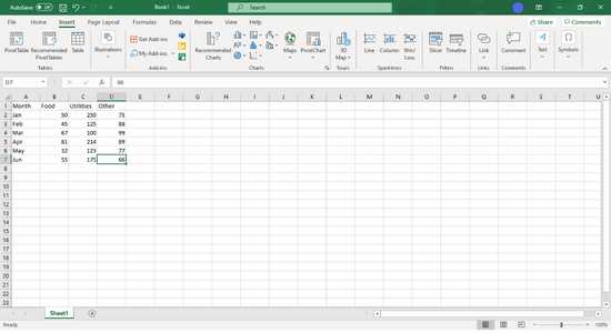
Since a graph needs two axes to display data correctly, it is a good practice to divide your data into two or more columns or multiple cells.
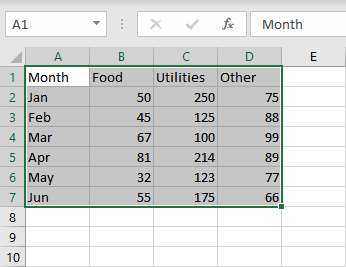
For instance, let's say you want to keep track of your budget over the year. Specify one column header or label named Month in cell A1, and enter those months under column A. Enter the column header names of budget categories on the first row, but enter the data starting from cells B1 through C1 and so on.
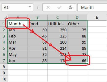
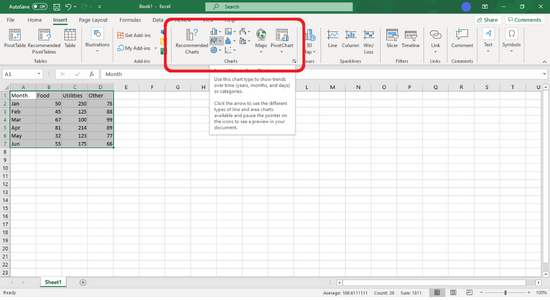
4). Highlight the data you want to display on the graph.
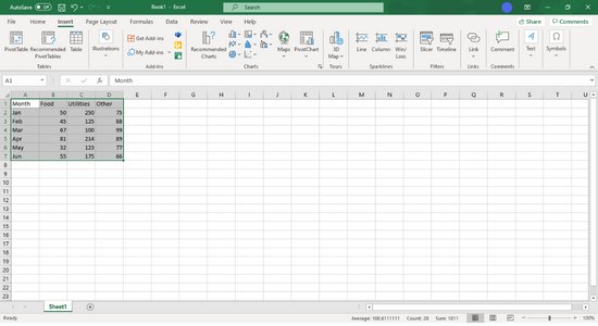
Click-and-drag your mouse pointer from the top-left to the bottom-right of the cells containing the data group, including the headers.
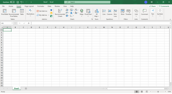
5). Hover your mouse over the Insert tab - located on the uppermost part of the app - and click on it.
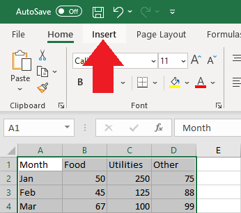
The Insert tab is visible between two other tabs: Home and Page Layout.
6). Move your mouse pointer to the Charts panel, and click on Insert Line or Area Chart.

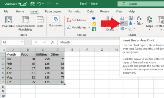
The Charts panel is a section where you can see all available graph styles and other buttons, including Recommended Charts, Maps, and PivotChart.
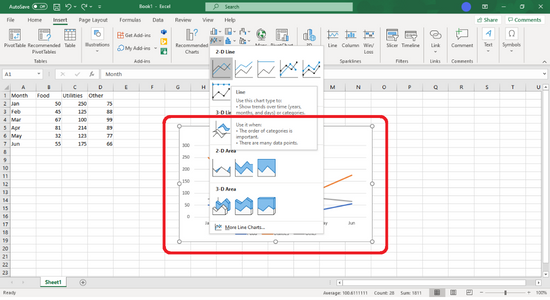
In this example, you are going to add a specific type of graph: a line chart. In previous versions of Microsoft Excel, a line chart is called a line graph.
The "Insert Line or Area Chart" button shows an icon with two intersecting broken lines and a small drop-down symbol on the right.
For now, select a 2-D Line to simplify this walkthrough.

Try to hover your mouse over one of the available options, and a preview of the graph shows up in the background.
7). After you decide on a template, click on it to generate a line graph in the middle of the app window.
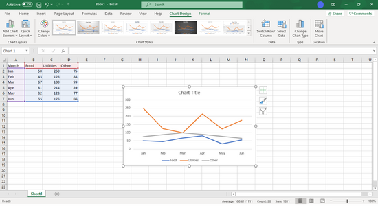
Then, the tab on the uppermost part of the app window switches from Insert to Chart Design.
Customizing A Graph
1). Modify the appearance of the graph.
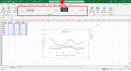 Once you create your first graph, the Chart Design tab will show up. Click on any variation in the Chart Styles section to modify your graph's appearance. To activate the Chart Design toolbar, click on the line graph that you just created.
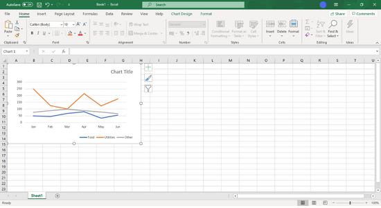
2). Place your graph in a visible area.
To move your line graph, hover your mouse cursor to an empty portion of it, long-click on your left mouse button, and release it once you reach the location.
You can apply the same procedure to the graph's headers and legend, but you cannot do the same thing to the graph lines. The appearance of these lines will only change if you make some modifications to your data.
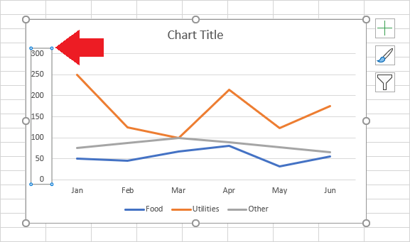
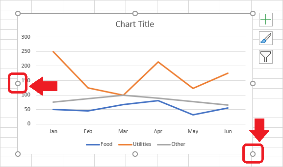
3). Change the size of the graph.
To resize it, click-and-drag one of eight circular adjustment nodes around your line graph.
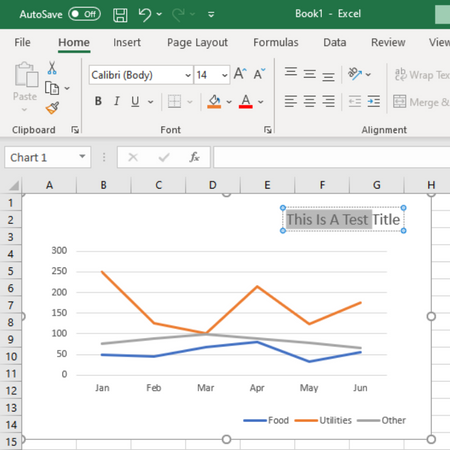
4). Change the title of the graph.
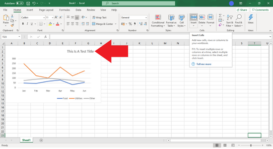 Click on your line graph's title once to select it, delay for one second, and click on it again to modify the text. Before you type any text, make sure that the text cursor is blinking on the title.
To save any changes, click on an empty area on your graph or workbook.
Summary: Make a Graph on Microsoft Excel
- Open Microsoft Excel.
- Click on the tab labeled "Insert."
- Select the type of graph, or chart, you would like to make.
- Click on your chart to bring up a toolbar at the right side of the window.
- Click anywhere outside of the chart box to deselect it.
- Click and drag your mouse to select all of the cells containing information you want to include in your graph.
